 ePub (Kindle)
 Printable PDF
Selecting the right product metrics (KPIs)

Executives want financial outcomes, strategists want systemic impact, managers want team accountability, teams want credit for executing work, planners want to track progress, ops wants to know that systems are stable and secure.
How do we select metrics that satisfy everyone?
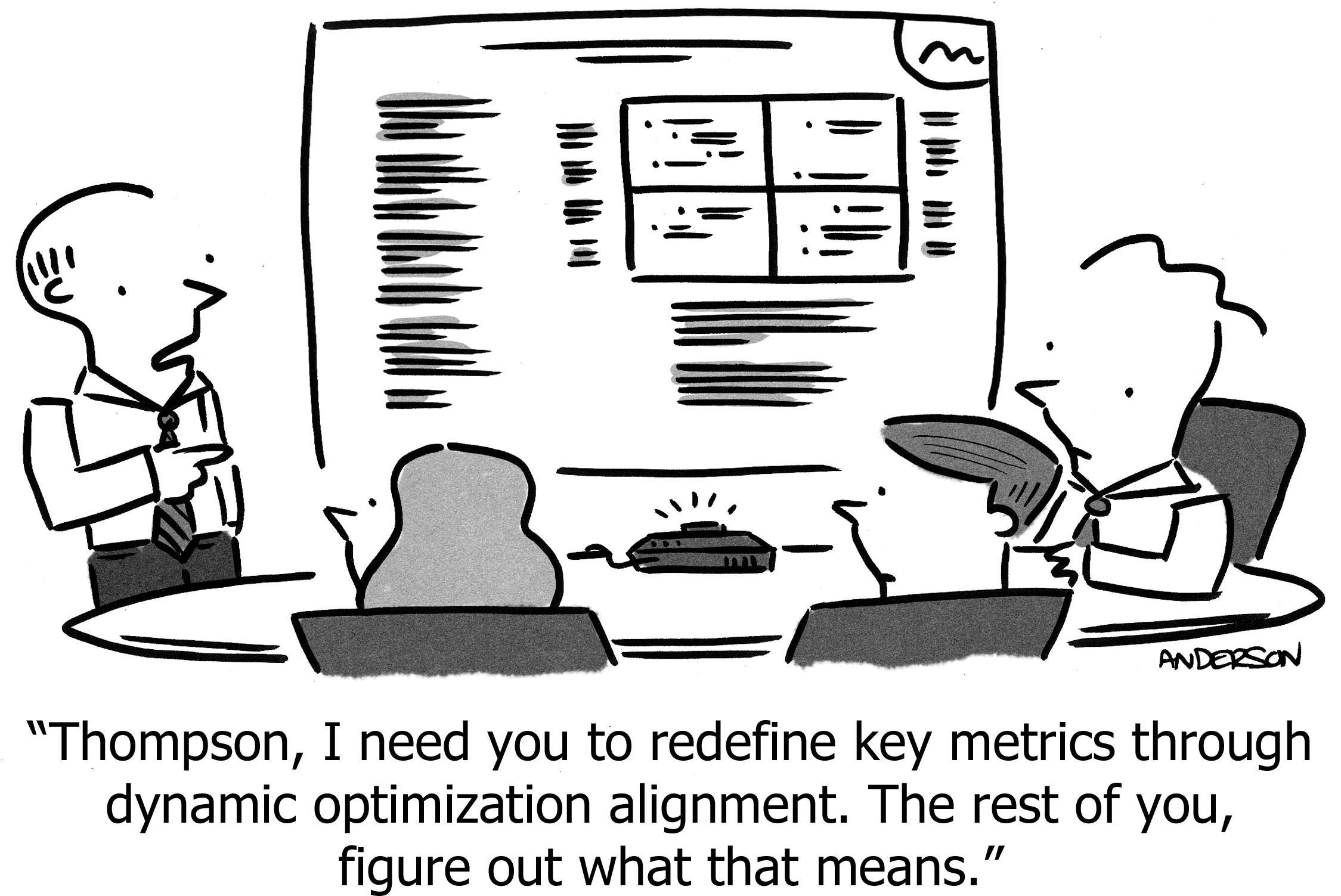
Much blood has been spilled on this topic. Frameworks range from poster-sized interconnected networks of boxes and arrows, to reductively selecting a single North Star metric to rule them all, to cascading goals like OKRs. An organization should pick whichever framework is most likely to be adopted and honored.
I used to believe that “one true metric” with a smattering of operational indicators was the best way to focus a team on “what matters most.” But I’ve come to believe in a more comprehensive system, that addresses all of the needs outlined in the opening paragraph.
Here is that system. Because all departments can “see themselves” in the result, I believe it makes stakeholders more comfortable, while giving the product team at the center of the maelstrom a practical view, not only of everything they do, but of everything they affect. It allows the team to measure things in the short-run while also maintaining the long view.
Metrics as a value-chain
A product sits in the middle of a chain of events, executed by the team, customers, and peers across all departments. The first step in understanding metrics, is to plot these events in time, by actor, and by the type of so-called “value” we might measure:
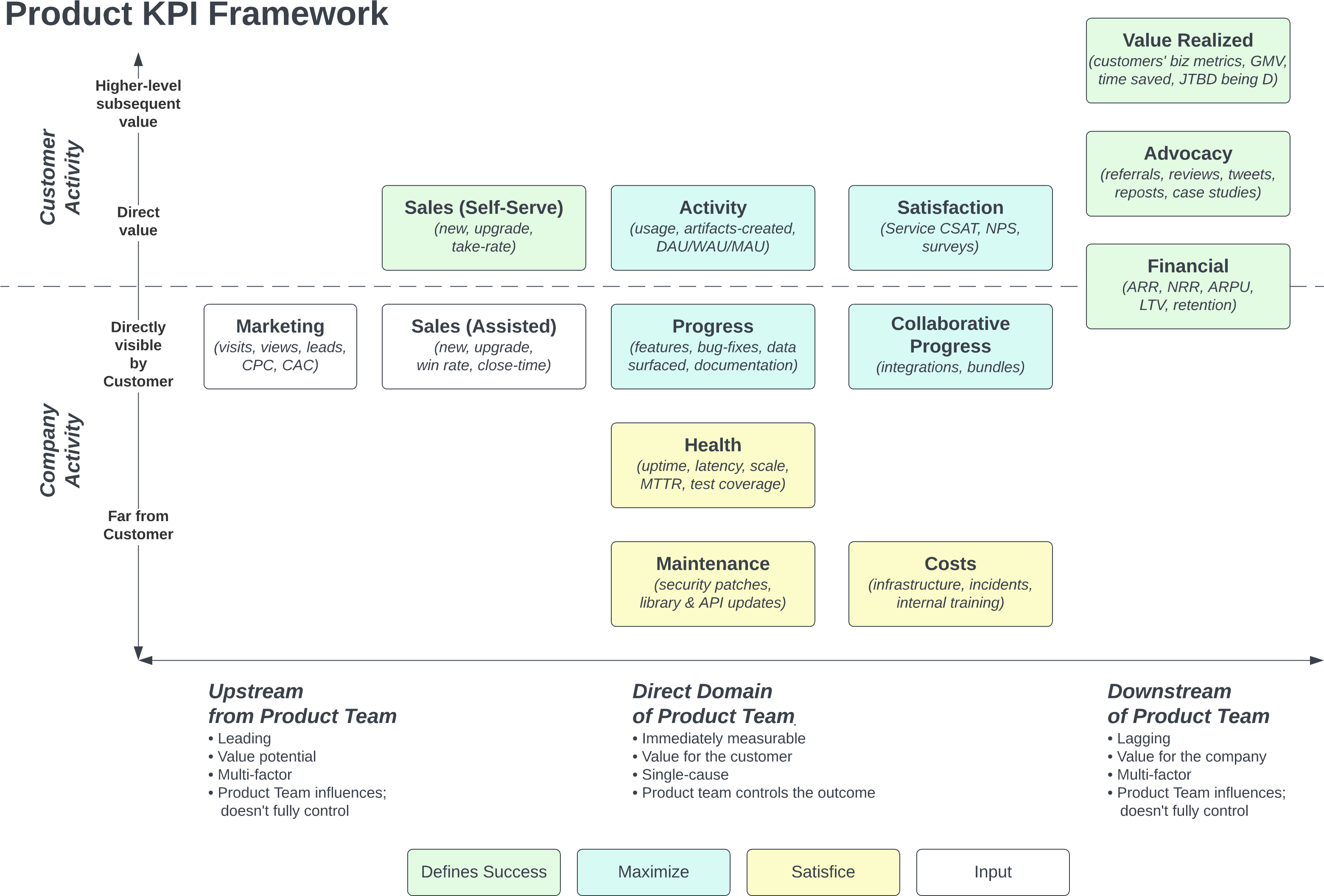
Figure 1
Use coloring to specify which metrics you are maximizing vs satisficing. Often “maximizers” are critical for the success of the product, whereas “satisficers” are important operational indicators that can’t be ignored, and require attention if they become a problem,1 but under normal circumstances shouldn’t distract us from what is most important.
Once you have this map, the metrics almost write themselves. Each box has one or more metrics that explains whether “it is happening” or “we’re making progress.” You could go a step further, adding arrows2 to indicate influences or funnels or conversions, adding metrics to each arrow.
1 At WP Engine we’re very happy with Google’s system for managing SLOs, in which “satisficing” KPIs are tracked continuously, but the team acts only when a KPI slips into “violation” territory, as opposed to fielding requests to invest in improving those KPIs. This threshold is pre-agreed with stakeholders, in periodic meetings outside of high-emotion catastrophes, when everyone can soberly decide under what circumstances we will interrupt high-value work to address a critical problem.
2 Also called a systems diagram, it could make the chart too busy, especially when “many things affect many things,” resulting in a dizzying bird’s nest of arrows. Perhaps the simplicity of “boxes only” outweighs the benefit of specifying all the value-flows. Or maybe include only the few, most-important arrows.
The axis of “time, immediacy, and control”
The horizontal axis emphasizes that some events happen prior to activity controlled by the product team, and some happen after. Most metrics frameworks have this concept of “leading” and “lagging” indicators, though some confusingly mix them all together.3
3 For example, often top-level OKRs are multi-input, lagging indicators, whereas team KPIs might be immediate, and it’s unclear where leading indicators go. This leads to unhappy conversations when teams meet their immediate KPIs, but the company’s overall KPIs appear unaffected.
Between those temporal bookends, we highlight that some of a product team’s activity can (1) be measured immediately and (2) the team is in full control of those effects, and therefore the team should be held directly accountable to those things.
This resolves the typical conflict that arises when executives ask “why isn’t the team more focused on increasing revenue in the next 60 days” while the team insists “other people don’t understand that we’re doing a lot of important work.” Work can—and should—be measured sprint-by-sprint, whereas revenue is a multi-input, lagging indicator of success. The product team is responsible for generating revenue, but it is not the only team or actor contributing to that final result, and a change in the product can take a while to show up in revenue; individual features often cannot be directly linked to revenue at all.
This doesn’t make “revenue” less important—indeed, it might be the most important metric! Rather, we have placed the metric in context, and understood that it can lag by months or even years,4 and therefore isn’t a good measure of what’s happening right now. If we’re successful at our “work” but not our “financial impact,” our conversation is naturally directed towards diagnosing that disconnect. If we’re not even successfully completing our “work,” or if the features that we made aren’t being used often, those are immediate facts and within the team’s control, and metrics should reveal it, regardless of downstream consequences on revenue. You can’t argue against solving for the customer!
4 Blackberry’s revenue continued to grow for two years after the iPhone launched; other KPIs were changing far more rapidly, and therefore were even more important to track.
Notice that often the “definition of success” also resides in those lagging indicators. This is another traditional cause of confusion, often articulated as “we should celebrate outcomes, not work.” It is true that if our work doesn’t result in the desired outcomes, we’re not finished yet. But, if we believe that the world is inherently unpredictable, that not all work will yield a large outcome, that outcomes require a combination of execution and luck, then we should agree that the job of an agile team is to continuously tackle that complex challenge, as opposed to expecting every idea to consistently produce the desired outcome.
Seeing how all the metrics are performing gives the team and stakeholders the information needed to completely understand what’s going on. Which is the whole point of KPIs.
The agile team must honestly and clearly measure both direct results and lagging outcomes. They are accountable for all of it, and measuring is required for accountability. But “not yet achieving the outcome” is not a complete failure, but rather a learning that will shape the work that will be executed in the next two weeks.
If the result confirms the hypothesis, then you’ve made a measurement. If the result is contrary to the hypothesis, then you’ve made a discovery.
—Enrico Fermi
The axis of “hidden, internal, external, and strategic”
We control what we do in our sprint; we don’t control what customers do. The company controls what other teams are doing; the product team doesn’t directly control that (much to the chagrin of product managers).
It’s useful to draw a bright line between what is external and what is internal. Often completely different people work in these two domains, e.g. product, design, support, and sales working directly with customers, whereas engineering, infrastructure, and security work inside the company. The diagram helps us appreciate everyone’s role, and use the right metrics for the right things.
Furthermore, some internal activities are close to the customer (e.g. releasing new features), while others are far away (e.g. applying a security patch). If all our work is invisible, we have a problem: Customers perceive a stagnant product, competitors appear to be moving faster, sales doesn’t have new things to say. On the other hand, if we value only the visible things, we end up with a bad product, with tech debt and unhappy engineers with slow delivery due to an under-invested foundation. The diagram makes this clear, honoring all of these important types of work.
The most valuable, strategic outcomes are often even more distant from the product team, whether because they are down-stream, or because they are second-order effects for the customer. We control “satisfaction” more than self-motivated external “advocacy,” yet the latter is clearly not only the ultimate measure of the success of the product, but also drives efficient growth. Product teams should take ownership of creating those outcomes, while not allowing those lagging, multi-factor metrics to be the only way we measure progress.
The most valuable thing is for the customer to achieve their own ultimate goal, as defined by the Needs Stack. If the customer’s business doesn’t thrive, they’ll stop paying for your software, no matter how good the software is. While of course the customer’s business is again a multi-factor, lagging metric, where nearly all the factors are outside of your control, it’s still ultimately the greatest form of value. Even if you can’t control it, you can notice the attributes of customers who tend to thrive, and direct your marketing, sales, and features towards that subset of the market, yielding higher growth and retention, and likely higher profitability.
Checklist for great metrics
From SMART goals to FAST goals to North Star Metrics, there’s plenty of prior art on how to pick good metrics. This is my own list.
- Defined in normal language
- “Customers are using feature X” makes sense. “Total unique IPs which caused at least one event from P, Q, or R to fire in our analytics system over a rolling 14 day period, divided by total unique IPs from the same system in the same period” is a precise way of measuring “using feature X,” but it’s too hard for normal people to scan and understand.
- Defined precisely
- In the previous example, you need that technical definition also. Frequently that definition is where we realize either (a) we can’t get exactly the metric we wanted, or (b) we have to do engineering work before we get the metric we want. This is especially important with concepts like “cancellation rate” or “cost to acquire a customer” which can be defined in myriad ways; it’s often useful to use different precise definitions for different metrics within the same company.
- Matches the intent
- Often the technical metric doesn’t actually measure what we stated in plain language. For example, we intend to measure “User Portal usage” but instead we measure “User Portal logins,” which only triggers when someone’s session expires. It is common to want to measure P, but P is too difficult or maybe even impossible, so we pick a proxy metric Q. That can be OK, but make sure the proxy really does measure the intended concept.
- Causes action
- If the metric does something differently from what we expect, would we act? Would we re-plan the next sprint, or even interrupt the current one? If the answer is “no,” it doesn’t belong on our main metrics board. It might belong on an operational board, if it’s explanatory, helping us to understand how things are functioning.
- Obvious what “good” look like
- Not all metrics should be attached to explicit goals, because some are for monitoring and understanding the situation, as opposed to something we’re actively trying to change or maintain. However, it should be obvious “what good looks like.” That could be as simple as “not changing,” or directional rather than specific (e.g. “usage increasing” as opposed to “usage going up 10% month-over-month”).
- Measures “what is happening” (not “work”)
- You already track work; metrics shouldn’t duplicate or summarize that. Metrics are about “what is happening” around us—the dials on the airplane dashboard, not the actions the pilots are taking. (Exception: Metrics that explicitly measure whether we are completing a volume or quality of work.) If the metric can be moved by, or applies to only one possible course of action, it’s measuring work and even presupposing solutions, instead of measuring “what is.”
- Measured easily
- Many metrics are useful, but remain un-updated in spreadsheets because it’s too hard to get them. Best is automated; second-best is manual-but-trivial.
- Measured frequently
- Daily is best. One of the advantages of “rolling N days” is that you can update it daily, yet still think in units like “week” or “month” if that’s sensible. Caveat: if the number doesn’t naturally change frequently, then it’s not important to measure it frequently. Still, in that case you won’t check it often, which diminishes its value.
- Stable definition and applicability
- Measure things whose definition is stable over time, ensuring that any observed changes are the result of deliberate actions or environmental shifts, rather than random fluctuations or alterations in the nature of measurement itself. This stability allows for meaningful month-to-month comparisons and more accurate assessments of strategies and outcomes.
- Uses common definitions when possible
- It’s tempting to invent your own metric, even when there are so-called “industry standards” or “best-practices.” Standard definitions might not be appropriate for your business, or violate one of the other rules above. Inventing your own language is also a form of team-cohesion. However, reinventing the wheel makes it harder for others to understand what you’re doing and precludes using benchmarks to see whether your metric is “good” objectively. There are even metrics where special definitions hide the signal; sometimes these are even used for deception.5 Don’t do that.
- Signal at least 2x stronger than noise
- Metrics often vary for reasons unrelated to the underlying signal.
Monthly revenue is like this—new, upgrade, and cancellation alike. Calendar months vary in days by ±5%. Furthermore, daily numbers can vary by 2x between a week-day and week-end, and calendar months vary in the number of weekdays by ±10%. So, if you’re tracking something like new revenue per month, even a real change as large as 10% is the same size as the noise, so you can’t actually tell if there was a real change.
Sometimes a clever alteration to the definition can remove noise. For example, “new revenue over rolling 28 days” eliminates the two factors just mentioned, and is fairly close to a calendar-month worth of revenue.6 Or if noise is infrequent, something like “median” or “95%tile” can ignore outliers.
But often noise is less predictable. In that case, it’s useful to ask how much is noise, and whether it’s so much that the metric isn’t useful. If you don’t know how much is noise, it’s probably a bad metric. - The team actually cares about it
- Whenever management requires a KPI that the team doesn’t believe in, doesn’t respect, doesn’t care about, the team always wins. You’re lucky if six months later the number is even being tracked; certainly they won’t be taking action on it. The team has to want to depend on it, look at it weekly at least, and change behavior if it hits some threshold. If you just assign it, or if there’s a sense that the number is meaningless or unfair, they simply will not react to it at best, and decrease morale at worst.
5 Common examples are revenue-recognition, classifying costs in or out of COGS/GPM, and conveniently leaving certain costs out of EBITDA.
6
To make it an “average calendar month,” you can multiply your trailing 28-day figure by 52/48, which scales it to the average number of weeks in a month.
I hope this system will be as useful to you as it has been for us.
Many thanks to Jaakko Piipponen, Jonathan Drake, and Vinod Valloppillil for contributing insights to early drafts.
https://longform.asmartbear.com/product-metrics/
© 2007-2026 Jason Cohen
 @asmartbear


