 ePub (Kindle)
 Printable PDF
Maybe not so much with the “optimization”

This weird-looking thing is a result of discontinuous innovation, not incremental improvement.
In the never-ending quest for optimization, A/B tests, metrics, and funnels, we’re in danger of losing the fun and value of creative work.
When we demand overwhelming customer outcry before committing to the slightest product change, we’re in danger of losing the value of creating a cool feature that takes too much effort but people just love.
When we do the minimum necessary to get the job done, we’re efficient but not thrilling. We’re “lean” but we’re not stirring hearts. We’re effective but not playful.
I’m as excited as everyone else about Lean principles gaining traction. And it’s true that most companies are erring on the side of too little objective feedback rather than too much. Still, every article I read turns the creative process of business and product design into Vulcan objectivity.
Sometimes you should do something just because it’s cool. There’s such a thing as product “taste.”
Look at this incredible display of affection IHumanable has for his computer:
This is one of the reasons I love my new iMac, it’s just a beautiful magic floating screen filled with win.
You couldn’t ask for a stronger endorsement. This is even better than “It saved me $725,231.” This is beyond utility—this is love. (Love wins.)
Does love come from feature bullet points? Do you earn love through A/B tests and implementing features off the top of GetSatisfaction? Or is this something else, something deeper, something less incremental, less data-driven, more gut feel, more emotional?
My first product at Smart Bear way back in 2002 had a non-optimal, floating-in-win invention called the “mini-viewer.”
Code Historian was my first product. It was the first file difference viewer with built-in support for version control systems, letting you view various historical versions of a file side-by-side. You could switch between which versions you were comparing with one click:

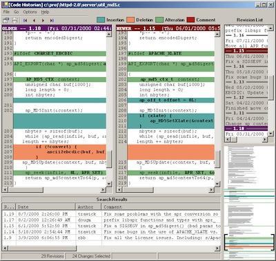
Figure 1
The thing to focus on is that user interface element in the bottom-right corner. That’s the “mini-viewer,” and in every measurable sense it’s a terrible business decision.
The mini-viewer summarized the modifications—the lines added, changed, and removed—so the user could easily see how many changes there were and where they’re located. Sounds useful, right?
Right, except it’s a really wasteful, expensive way to do it. Many competitors used a different technique I call “boogers,” because to me it looks like someone shot snot rockets all over the screen, and also because it’s fun to deride competitors, because it feels good to make fun of other people who (appear to) have more revenue than you do.
But don’t you agree? They look like boogers:

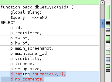
Figure 2
The boogers are smeared by the scrollbar, indicating where you’d need to scroll to see differences between the two versions of the file.
Now by all of the usual arguments for Lean, Agile, and minimalism, I should have used boogers too:
- Boogers were already semi-standardized. User interfaces should follow the principle of “least surprise”—if people are used to a certain metaphor, icon, or behavior, you should honor that so people understand your product immediately. No one else had a mini-viewer.
- Boogers occupy minimal screen real-estate. It’s just a thin strip no wider than a scrollbar; in fact some products put the boogers on top of the scrollbar. The mini-viewer is not only larger, it has significant width, which means you have to occupy the rest of the right side of the screen with other crap.
- Boogers appear right next to the scrollbar, which is where you look anyway when navigating the file.
- Boogers take less effort to compute than the algorithm for determining color variations in the mini-viewer.
- Boogers take less effort to draw. Boogers are drawn on the screen once, and don’t change unless the window is resized—an infrequent operation. The mini-viewer however indicates your current scroll position in the file (those black brackets) so when you’re scrolling around the file the speed at which you can recompute and redraw the mini-viewer matters. Drawing directly on the screen causes flickering, so you need off-screen buffering. In short, the mini-viewer is a lot more programming effort with a lot more chance for bugs.
- The mini-viewer doesn’t convey more information than boogers do.
And yet, everyone loved the mini-viewer. People sent emails saying they used Code Historian just because of the mini-viewer. Some developers wrote in asking how I was able to render it so efficiently. It was always a high point in product reviews.
The mini-viewer was wasteful, but fun. It wasn’t optimal and had no measurable benefit to usability, but it was “filled with win.” It took extra effort but it was endearing—an important attribute not easily captured with metrics and spreadsheets.
Now sure, there are many of aspects of business and product development where it’s best to stop obsessing and just cut corners. Often we can and should accept 80% of the benefit if it means 20% of the effort. Customers generally prefer the right features over more features.
But sometimes it’s your job to fill the screen with joyous win.
https://longform.asmartbear.com/creativity-over-optimization/
© 2007-2026 Jason Cohen
 @asmartbear


