Color Wheels are wrong? How color vision actually works
Why are artists special?
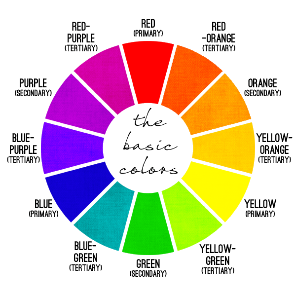
Ask any artist to explain how color works, and they’ll launch into a treatise about how the Three Primary Colors—red, blue, and yellow—form a color wheel:

Why “wheel?” All other colors are created by mixing these three colors various proportions, they’ll explain. In particular, mixing equal quantities of each pair of Primary Colors produces the Secondary Colors (orange, green, and purple):

Continuing this process produces the full color wheel you might have learned in school; a pretty, symmetrical, satisfying device in which each hue melds seamlessly and linearly into the next:
Unfortunately, this crumbles under even minor scrutiny
For example, open up your desktop printer and you’ll see something quite different:

Three colors of ink which, when combined, produce all others: cyan, magenta, and yellow. (Black is included as a money-saver—black is the cheapest and most common color; it’s cheaper to have a black cartridge than to dump ink from the other three.)
But wait! I thought the “Primary” colors were red, blue, and yellow, not cyan (bluish-green), magenta (bluish-red), and yellow. So one primary is the same (yellow) but the other two are different… yet these still generate color wheels containing all the other colors. So what does the “Primary” designation really mean?
Also it’s not as simple as saying “any three colors can produce all the others” because that’s clearly not true (by experiment). And it’s not as simple as saying “any three colors will do, they just have to be equally spaced around the color wheel,” because yellow is common to both the painter’s and printer’s wheel, yet the other two primaries differ completely (red and blue are primary in the painter’s wheel but secondary in the printer’s wheel.)
TVs and computers are different yet again. If you stand close to a CRT (non-flat-screen), you can see that every pixel (or “dot”) is really three tightly-packed colored phosphors: red, green, and blue.
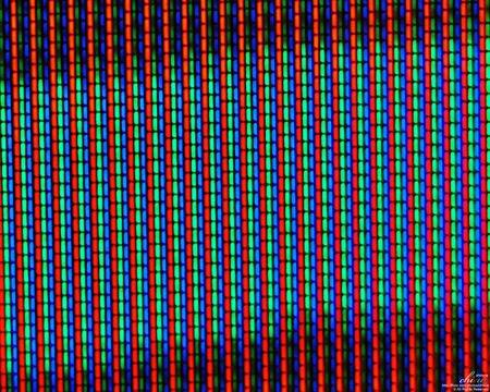
If you’ve done computer graphics you’ve been forced to name colors using these “RGB color values;” true geeks automatically think “yellow” when they see #FFFF00. (If it’s intuitive to you that #A33F17 is burnt orange, it’s time for you to leave the monastery.)
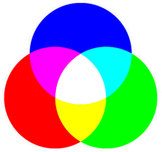
This leads to yet another system of three “Primary” colors generating all the others, and yet another color wheel. This one is a little easier to explain—ink and paint are “subtractive” (adding cyan, magenta, and yellow yields black) whereas colored light is “additive” (adding red, green, and blue yields white):
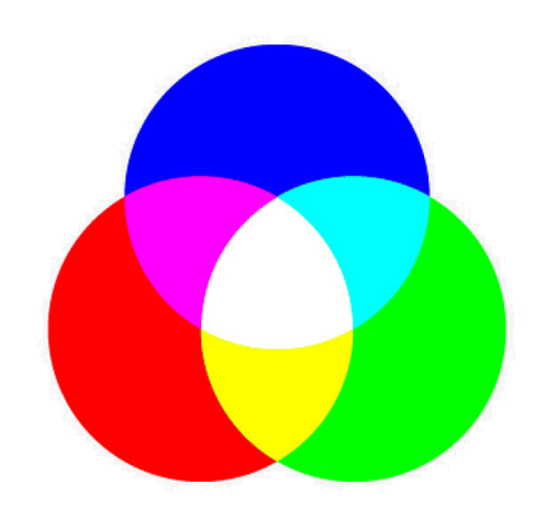
Still, we have yet another color wheel in which two (but not all three!) “primaries” match those of the artist’s wheel and none match the printer’s wheel.
This isn’t adding up. Let’s turn to science.
Physics makes it worse
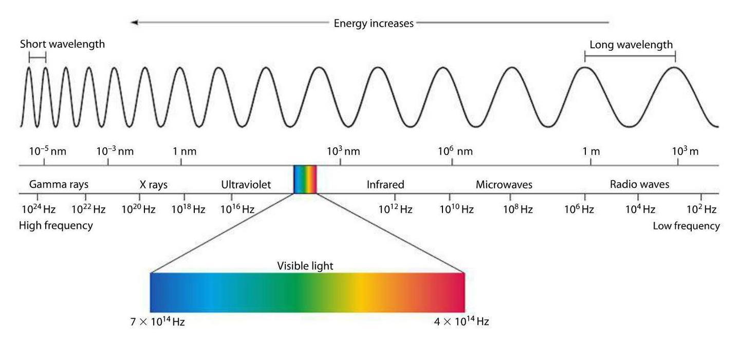
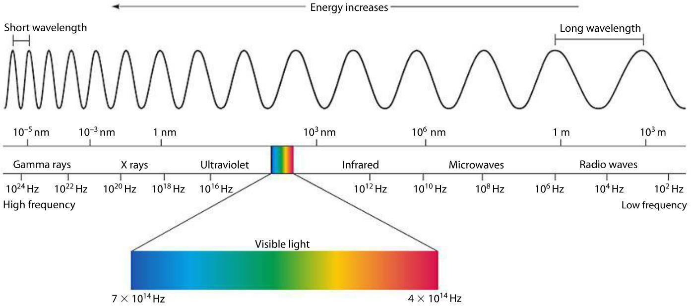
Physics is clear and certain. Light is a wave of electromagnetic energy (and/or a particle, but for today it’s just a wave OK?) and, like a vibrating guitar string, light waves wiggle at certain frequencies. Some of those frequencies we detect with our eyes, and the frequency determines its color:
Now we’re getting somewhere! Or are we?
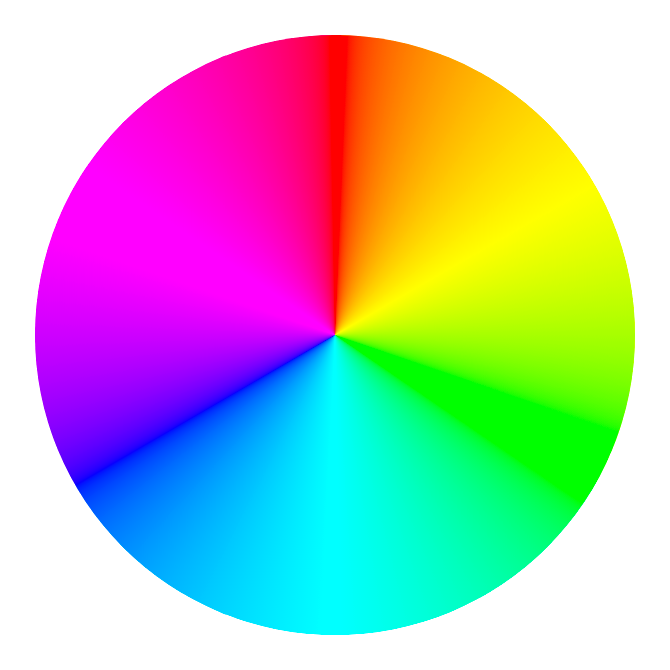
First off, we’ve suddenly lost the notion of a “wheel.” As much as the previous color systems have contradicted each other, at least they all agreed that hues transform smoothly and continuously, one to the next, a beautiful symmetry with neither beginning nor end.
But here we have a clear beginning (red) and end (violet). The colors in-between are continuous—and seem to generally match the order seen in the various color wheels—but then it just terminates with violet. How does it get back to red? What about that fuchsia / magenta / purplish-reddish color which is clearly present in every color wheel but missing from the physical spectrum?
How can a color be missing? Where does it come from?
But wait, we’re not done being confused.
And another thing: Opposites
Every seven-year-old kid in America is taught that “the opposite of red is green” and “the opposite of blue is yellow.” But what does that mean exactly?
After all, there’s nothing in that linear physical light spectrum to indicate that any color is “the opposite” of any other, particularly not those two pairs. And the color wheels aren’t much help either; trying to match the “opposites” on the painter’s wheel yields an unsatisfying asymmetry where two of the primaries are opposite, and the third is opposite from a secondary:
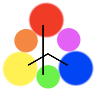
But “opposites” are real. In the early 1800s Goethe (yes, the Goethe) noticed that red/green and blue/yellow were never perceived together, in the sense that no color could be described as a combination of those pairs. No color could be described as “reddish green.” If you are asked to imagine “a green with a bit of red,” nothing comes to mind. In the following 150 years, various experiments tested this idea, all of which validated his observation.
There’s something to this. Something neither the wheels nor the spectrum can explain.
It’s time to get down to the real source of color: The ridiculous complexity of human beings.
The answer: Physiology (of course)
Caveat Emptor: The following is a gross and irresponsible over-simplification of what actually happens. But it’s correct in its general thrust, and few people on Earth (myself excluded) are qualified to explain with complete accuracy, so in the interest of general illumination, no pun intended, OK maybe intended just a little bit, I’m doing it anyway.
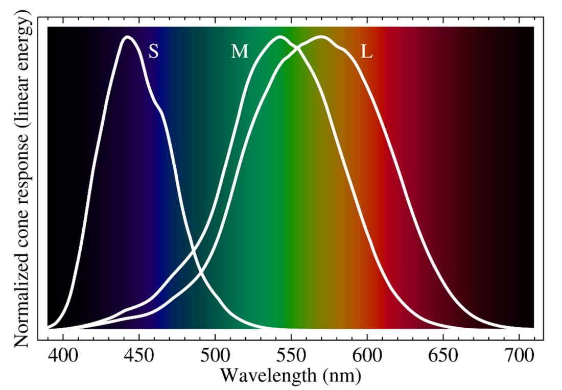
Of course it starts in the eye, where three types of cells called “ cones” measure the amount of red, green, and blue light hitting the retina.
“Ah ha,” I can hear you CSS freaks scream, “it’s RGB after all! I was right! All that time spent—nay invested—in remembering that #001067 is the default title-bar color in Windows 95 was well worth it!”
Hold on there, cowboy. Actually, “amount of red, green, and blue” is a gross simplification (as warned!). Peeking under the hood (just a tad), the three types of cones are in fact denoted S, M, and L for “short, medium, and long” wavelengths, and each respond at different levels in a range of wavelengths:
But I digress, and besides I did promise to be all gross and irresponsible, so let’s go back to that.
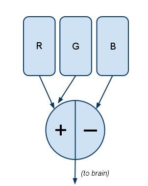
So there are R, G, and B cones. The signals from these cones don’t go straight to the brain; they first pass through a pre-processing filter, and it’s this filter that explains all the mysteries. Actually there are three filters.
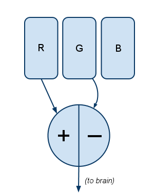
Filter #1 works like this:

Explanation: The more R there is, the more positive the signal; the more G, the more negative the signal. If there’s relatively equal amounts of R and G—whether from none of both, a little of both, or a lot of both—the signal is zero.
This explains why there’s no “greenish-red.” Because:
Let’s say R and G can go between 0 and 100 units of intensity. Consider the case of “full red with a little green,” where R=100 (full intensity) and G=25 (one-quarter intensity). Then separately consider the case of “strong red with no green,” where R=75 and G=0.
In both cases, Filter #1 computes the same output signal: 75. But remember the brain doesn’t get the raw R and G signals—it only gets the filter’s output—so the brain cannot tell the difference between these two scenarios.
So there’s no such thing as “red with a little green”—there’s just a less intense red. The brain physically cannot see “greenish-red” because the filter removes that polarity.
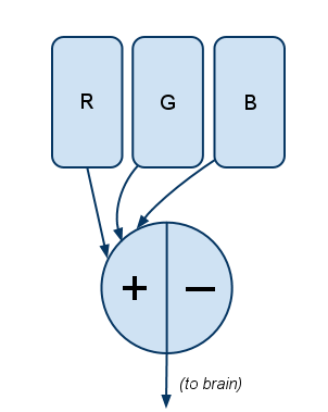
Knowing that blue/yellow is the other opposite pair, you can probably guess what Filter #2 is:

Here blue (B) is opposed with a combination of both the R and G channels. The R and G cones are stimulated either when there’s literally both red and green light (like when a CSS coder turns on both red and green as #FFFF00 to create yellow), or when 570nm light (yellow, on the visible spectrum) stimulates both R and G cones.
Filter #3 is simple:

In short, it measures the quantity of light without regard to hue. This is “how bright,” or “luminance” in color-theory parlance.
And magenta? It comes from full R and B with no G, activating Filter #1 full-positive, Filter #2 at zero. It’s not a physical wavelength of color, it’s just a combination of outputs of two filters.
The perceptual color wheel
To do this “wheel” thing properly, you should represent the red/green and blue/yellow opposites. It’s not at all difficult, so it amazes me how rarely it’s seen or taught:

Four primary colors? Yes, why not? It’s the closest thing to the physiology without getting complex.
Why is it necessarily a “wheel?” As you trace the (real, physical, see: rainbows) visible light spectrum, filter 1 starts full positive, then goes smoothly through zero and then negative, then back towards one. On the diagram just above, that’s the values of the x coordinate of a circle as you trace an angle counter-clockwise starting from pointing rightward along the x axis. So, like cosine, the first filter creates that plot.
Filter 2 does exactly the same, but produces the y coordinate of the circle, like sine: it starts as zero, then moves towards one, then back to zero and then negative, ending towards where it started.
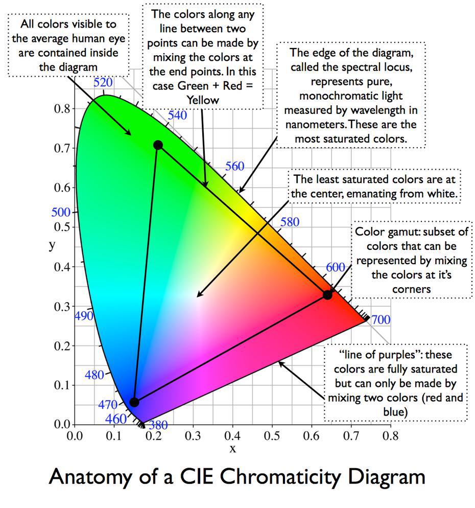
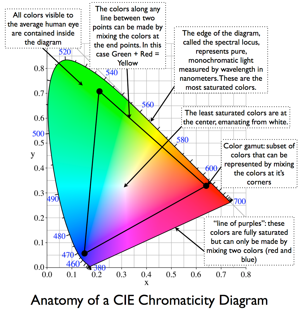
So the color wheel is a simplified, idealized way of plotting filters 1 and 2 through the natural spectrum, and the math of the biological filters naturally plot a circle. Of course the real shape isn’t a perfect circle, nor are colors evenly distributed around it, but the general idea is both directionally correct and useful. The CIE color space is closest to perceptual reality:
Bonus Brain Bender: The context / color connection
This is just the beginning of color theory. To give you a glimpse at how complex it gets, consider this:
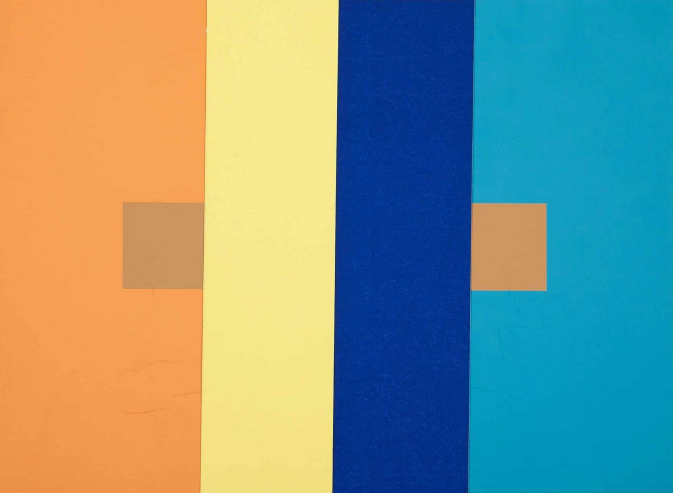
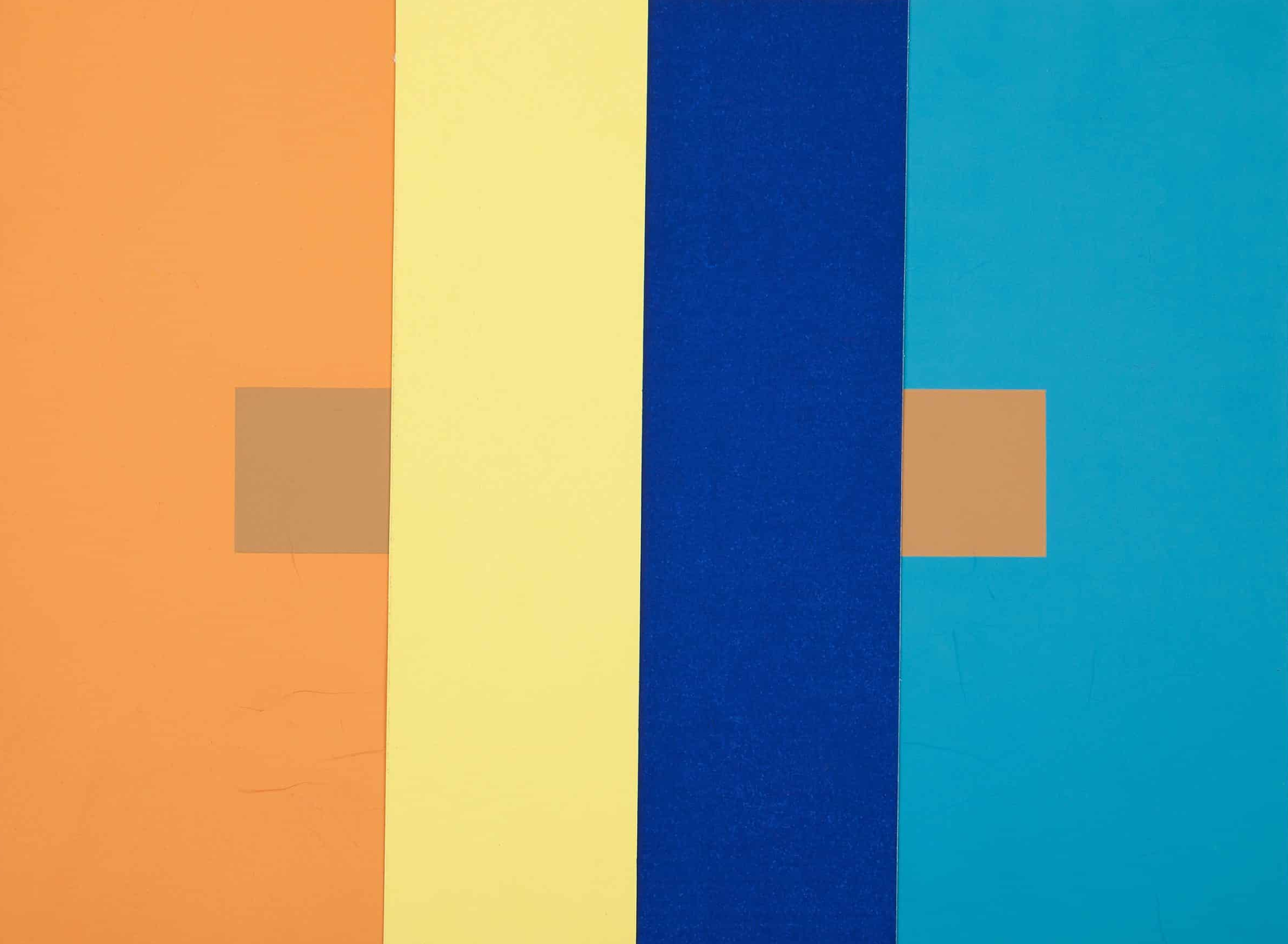
When a color is juxtaposed to other colors, we perceive it as a different color. For example, most people will say the small square on the left is brown, whereas the one on the right is orange:
Josef Albers, Folder IV-1
Actually, the squares are exactly the same color! The surrounding context dictates the perceived color, on top of all that wavelength-physiology we just did.
This makes sense because the brain projects abstract things it knows about the natural world onto your perception of color. For example, we know intuitively that shadows artificially darken colors, so our brains automatically account for this in our perception of those colors. (It’s called “color constancy.”) For example, you know that the dark and light colors on this hot air balloon are “the same:”
But it also results in optical illusions so powerful that even when you know the trick you still can’t see it correctly.
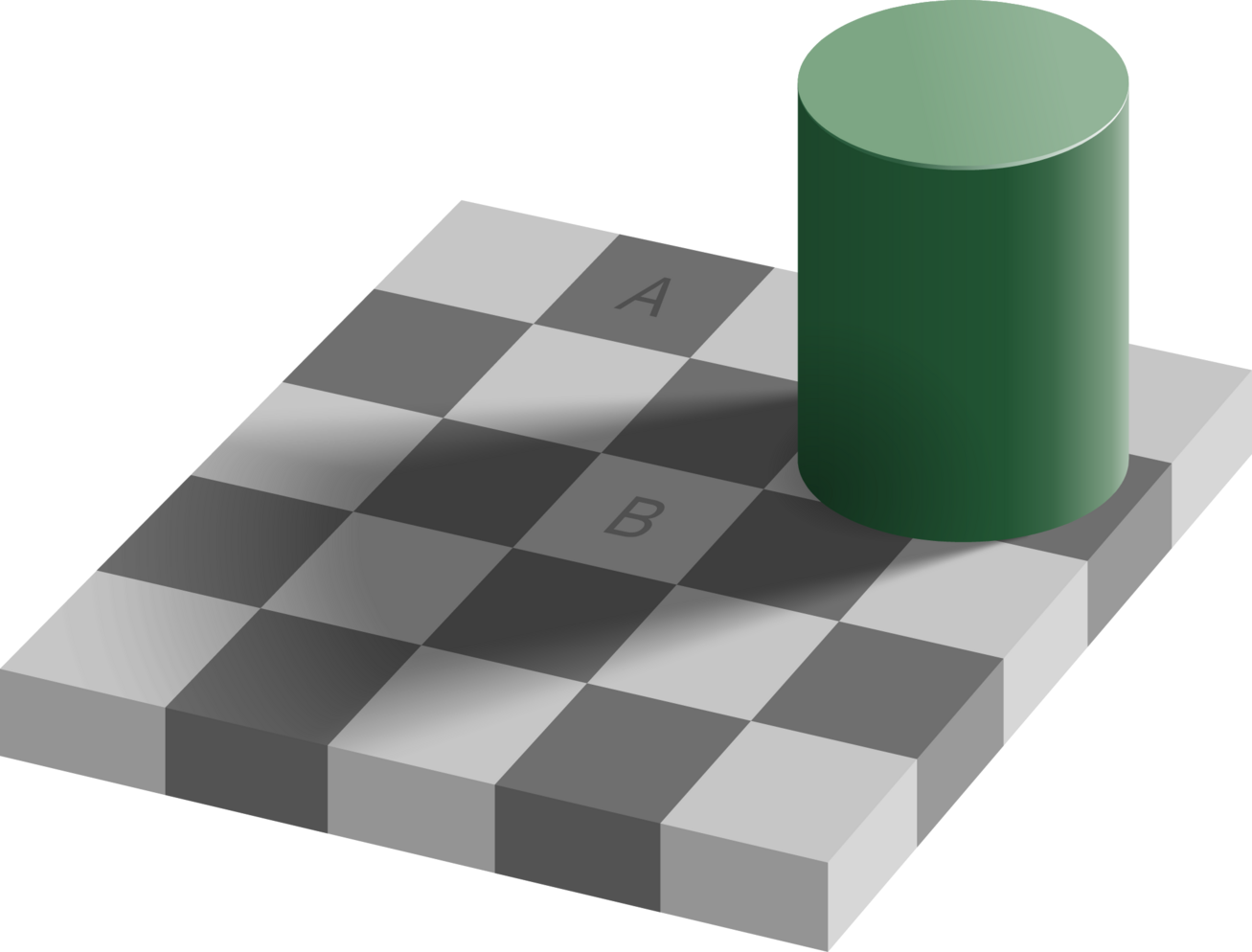
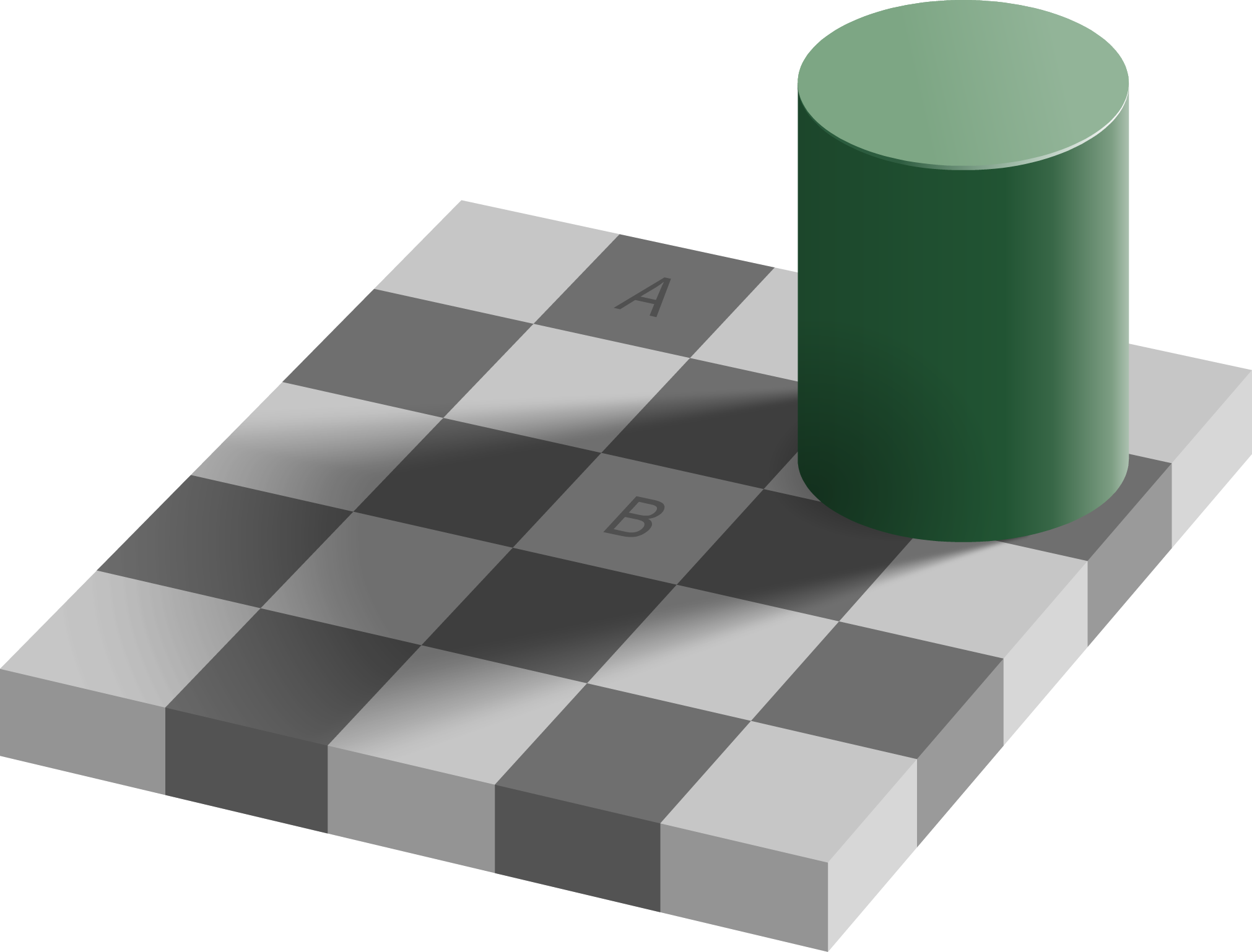
Like this: Which square is darker: A or B?
In fact A and B are the same color (#787878), but you can’t see it even when you know this. To prove it to myself I had to open this picture in an image editor and actually move one square over another to see it was the same.
Freaky.
Further Reading
You got this far? You still care? Sheesh, you’re as weird as me.
If you really want to lose a few days of your life, this is an amazing, in-depth treatise on color theory. That link is just page 1 of 8. Good luck.
https://longform.asmartbear.com/color-wheels/
© 2007-2026 Jason Cohen
 @asmartbear
 ePub (Kindle)
 Printable PDF
